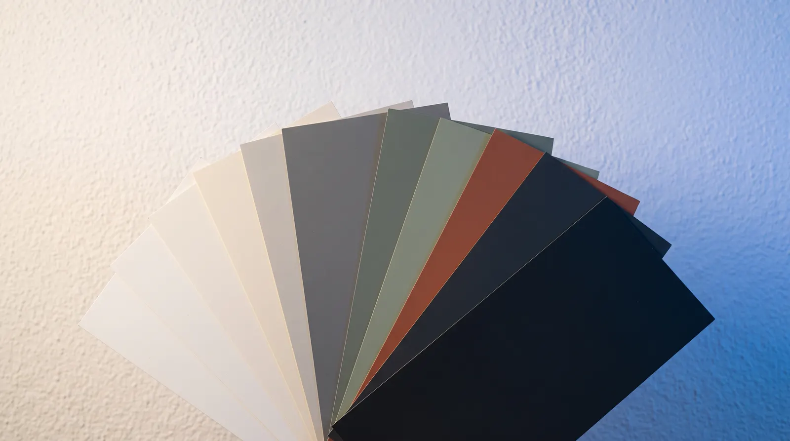
Choosing the Right Render Colour: Technical and Aesthetic Considerations
From the most popular whites and greys to HBW light reflectance limits, planning rules and sample-versus-wall surprises, here is how to choose a silicone render colour with confidence.
Choosing a render colour feels like the fun part of an external wall insulation project, and it is — but it is also a decision with real technical consequences. The shade you pick affects how much heat your walls absorb, how the finish weathers over the years, and whether your local planning department has anything to say about it. Here is how to get the choice right, from the physics of dark pigments to the surprisingly large gap between a colour card and a finished wall.
What Most Homeowners Actually Choose
It helps to start with what other people are doing. EWI Pro, the system manufacturer whose renders we install, publishes data on which silicone render colours leave its factory most often, and the pattern is striking: whites and soft neutrals dominate. Pure White alone accounts for nearly three in every ten orders of its flagship silicone render, and the two white shades together make up roughly a third of everything sold. Add greys such as Smoke and Ash — which between them take another sizeable slice — plus warm neutrals like Magnolia, Ivory and Sandstone, and the ten most popular colours cover about two-thirds of all orders.
That concentration is no accident. Whites suit both period and contemporary properties and create crisp contrast against dark windows, doors and roofs. Mid-greys sit comfortably alongside anthracite frames and slate roofing without shouting for attention. Warm creams and sandstones flatter traditional brick, stone and timber. The popular colours are popular because they solve the most common design problems on British streets.
Dark Colours Absorb Heat — and Your Render Feels It
The most important technical fact in render colour selection is simple: dark surfaces absorb more solar energy than light ones. A white wall reflects most of the sunlight that hits it; a charcoal wall soaks it up as heat. On a south-facing elevation in summer, a dark render can run dramatically hotter than a pale one on the same house.
Why does that matter? An external wall insulation system puts a relatively thin render layer over insulation boards, and insulation is very good at stopping heat passing inwards. With nowhere to go, the heat stays in the render, which expands during the day and contracts each evening. Over many years, that repeated thermal cycling raises the risk of hairline cracking and premature ageing compared with a lighter finish.
Understanding HBW: The Light Reflectance Number
This is why the industry uses a light reflectance measure, often quoted as an HBW value (from the German Hellbezugswert), to grade colours. The scale runs from 0 for a surface that absorbs all light to 100 for one that reflects everything. A brilliant white sits near the top of the scale; a near-black sits near the bottom.
Render manufacturers set a minimum HBW for colours applied over insulation, and colours below that line are generally not recommended for large EWI elevations [VERIFY: exact HBW threshold — figures in the range of roughly 20 to 30 are commonly cited for EWI systems, but confirm the current EWI Pro specification before quoting a number to customers]. In practice this rarely limits anyone badly. Most of the shades homeowners actually want — whites, greys, creams, stone tones — pass comfortably. Where a genuinely dark colour is essential to a design, the safer route is to confine it to smaller, well-shaded areas such as plinths, porches or feature panels rather than a full sun-facing wall, or to use it as the accent in a two-colour scheme.
Matching the Colour to Your House and Your Street
Technical limits aside, the best colour is the one that works with everything around it. Before falling for a shade in isolation, look at the fixed elements you are not changing: the roof colour, the window and door frames, any exposed brick or stone, guttering and fascias, and the garden walls and paving in front of the house. A warm cream against orange-toned brick reads very differently from the same cream against blue engineering brick.
Then widen the view to the street. A house that matches or gently complements its neighbours tends to look considered; one that fights them looks like an accident, however lovely the colour is on its own. That does not mean copying the house next door — a two-colour façade, with a lighter main field and a deeper tone picking out bays, banding or the ground floor, is a well-established way to add character without breaking the streetscape.
Planning, Conservation Areas and Listed Neighbours
For most homes, changing your render colour needs no permission at all. But there are exceptions worth checking before you commit. In conservation areas, national parks and areas of outstanding natural beauty, councils often restrict external alterations, and some issue guidance on acceptable façade colours or require an application for external wall insulation itself. Listed buildings need consent for almost any external change. Even outside designated areas, a small number of estates carry restrictive covenants on external appearance.
None of this should put you off — it just belongs early in the process, before you set your heart on a shade. A quick look at your council's planning pages usually settles it, and we routinely help customers work through these questions during quoting.
Why the Wall Never Looks Like the Sample
Here is the trap that catches the most people: colour perception changes with scale and surroundings. A small swatch is viewed close up, often indoors, surrounded by other colours. A rendered elevation is tens of square metres of the same pigment viewed in daylight, and large areas of colour almost always read lighter and more intense than the sample suggested. A grey that looked pleasantly soft on a card can feel steely across a whole gable.
Surroundings matter too. Pale renders pick up reflected colour from whatever is nearby — EWI Pro notes that a white house near the sea can take on a bluish cast from sky and water, and the same effect happens more subtly with green light bounced from lawns and trees. Screens add another layer of distortion, since every phone and monitor shows colour differently. Our interactive render colour browser at /render-colours is a genuinely useful way to explore and shortlist shades from the EWI Pro palette at home, but no screen should make the final call. That is why we bring real sample pots to the free survey and apply them where you can judge the colour on your own walls, in your own light, at different times of day.
Texture Changes Colour Too
One last subtlety: the same pigment does not look identical in every finish. Silicone render comes in a choice of grain sizes, and the texture interacts with light. A finer grain gives a smoother surface that reflects light more evenly, so colours tend to appear cleaner and slightly brighter; a coarser grain creates more micro-shadow across the surface, which can soften and deepen the same shade. Manufacturers make the same point: a colour code guarantees the pigment, not the appearance, so grain size and colour should be chosen together rather than one after the other.
Getting the Decision Right
Pulling it together: start from the popular, proven palette of whites, greys and warm neutrals unless you have a strong reason not to; respect the light reflectance limits on dark colours, especially on sunny elevations; check planning constraints early if you are in a designated area; and never sign off a colour from a screen or a tiny card alone. Shortlist a few contenders, see them at scale, and let your own walls cast the deciding vote. If you are weighing up colours for an insulation and render project, book a free survey and we will bring the sample pots to you.
// RELATED
More Articles

EWI Pro Silicone Renders: Choosing the Right Finish for Your Home
APEX EWI explains the four EWI Pro silicone renders we install — EWI-040, 075, 076 and 077 — and which finish, grain size and colour suits your property.

Silicone vs Acrylic Render: Which System is Right for Your Project?
Silicone and acrylic renders both outperform cement, but they suit different walls, budgets and timescales. Here is an honest comparison of breathability, durability, cost and maintenance to guide your choice.
// EXPERT GUIDANCE
Need Professional Advice?
Our technical team is here to help with your EWI or rendering project. Get professional guidance tailored to your specific requirements.